Categories
Daily 365

Dreary Walk


YouTube Preview Image

This is an match-moving animation I worked on for the PFhoe AE-Tuts Contest. My original idea was to do a family circus path line after a few lines of text. You can see a test of this on my 365 page. I was going to do this in Cinema 4D but the path looked like it was sliding awkwardly. I tried it in after effects and it looked off as well.  So I scraped that idea and went with an all text approach.

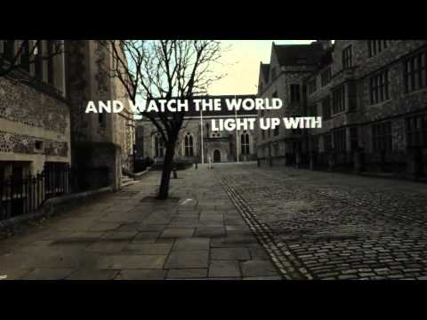
I found a good quote that went from negative to positive and animated the last word in each part. This allowed me to keep my overall idea  of going from dark and dreary to positive and happiness.  I used some color correction techniques from the Color Correction Handbook I won from AENY to try to simulate going from a dark grey scale dreary world to a lit up bright happy world. I think I should have pushed the end color more but it didn’t quite feel right the way I was going. I also added a moon in, which is hidden/blurred most of the time, some depth of field and a glow sun at the end.

I’m not sure if this will get in or not since I did submit after the deadline of midnight. For some reason I though it would be tomorrow’s midnight, which of course would be 7th not 6th. So shame on me for not understanding the due date.

Lastly for the list of all the thing I need to fix. I won’t be submitting these but it will be good just to make it more final.

  • overall text feels…odd…not sure what it is though
  • Some of the text’s fade out seem a little quick I need to adjust for that
  • I seem to have lost the depth on the Annoy letters, need to fix and re-render
  • When the JOY text comes in there a blur on the whole thing, not just the joy
  • The Joy doesn’t seem real joyous, need to add some more pop to it
  • The Joy floats back and thought I knew how I did it but apparently not and I feel like it is out place even though I liked it at first
  • end was click in the audio
  • shadows… there are none in the scene but putting stuff in the scene need shadows to make it feel there. Not sure what to do about that.


Audio from http://www.incompetech.com


Categories
3D Animation Motion Graphics

Nickelodeon Hand Clapper Animation

YouTube Preview Image

Categories
Daily 365 Downloadable

Nickelodeon Hand Clapper


For some reason the other day I felt like I need to model something. So I went to my basement and digded through 3 or 4 bins of old toys and I wound up with three; Leonardo Ninja Turtle with spinning arm action, Old original mini transformer, and Nickelodeon Hand Clapper from McDonald’s I think. I ruled out the Ninja turtle from the beginning, it was just to play with, and went with the Hand Clapper.

It took me about me a while to get the base of  it done. I tired to model this the more correct way rather then my normal quick way of cutting everything using booles. Adding some details and getting the edges right took another hour or so. I was going to keep adding more detail to make it as close to the toy as I could be then I got the Idea for some Xpresso and finished quickly and jumped into that. That might have been the reason I didn’t model the hands ( model from turbosquid ).

The Xpresso in this project is not too complicated, I liked all the moving parts (trigger, applause sign & hands) together so they move in tandem with each other like the toy does.  I also have an automatic switch that allows the hand to clap on their own without any keyframes. Originally I had this setup planning to use if statements to switch it and increment the value, then I found this forum post which showed an easier way. All you have to do is choose the speed and range you want it to clap and hit play. You can also adjust the curve to create some unique claps.  There are switches for high quality as well.

That’s pretty much it. You can download the model with the Xpresso setup and use it anyway your like. I’m rendering out an animation with it and will post it when it is finished.

Nickelodeon Hand Clapper


Categories
Daily 365 Music

Designers.MX Animation and Playlist

Today I’m sharing my work in progress for my Designers.mx animation & my playlist of my favorite songs(so far) that I have added to my grooveshark music.  I found out about  Designers.MX from Colin Oakes via twitter & since then I have listened to it a lot. Its a site where you can listen to music mixes by really good designers who also design a cover for their mixes as well.


I have gone through probably 75% of all of them and I can’t think of one where I didn’t like listening to it even if the music was different from what I normally listen too. Below you will fin a playlist widget I setup through grooveshark where you can listen to my favorite songs so far. This will update automatically as I find new songs I like.


Since I have listened to music so much on Designers.mx I thought I should make an animation about it. Below is my early work in progress for the animation. My goal is to use the covers have them fly though space and eventually run into the triangle part of the logo.

I have an outline of what I want to happen with a pseudo storyboard, I’m just going though it and figuring out how to do what I have planned out. Animations still really rough right now but my idea comes across some what.

YouTube Preview Image


Categories
General

Lower Third Project

This past week or so I have worked on a project file that I plan to put up on videohive to sell. It’s garbage truck lower third to be used in any video. You can see a early work in progress I did on my 365. I also made a standalone render of just the truck.

I have most of the functionality of the third setup and ready to got.  I have about 16 total that allow you to control everything without needing to go look for each item in the comps. You can even change the color of the rear compactor.  Now I just need to render the final truck and put all together and make the files so that I can submit it.


Categories
Daily 365 Downloadable Xpresso Tasks

Xpresso Task 7 + Lego Swirl Cinema 4D File


I though I should share my result for roberleger.net Xpress0 Task 7. The first file below has my setup for the product table. My setup is pretty straight forward with only one extra flair for a custom shape. I would suggest looking at the results page to this lesson and checking out the other solutions.

The second file is part of my lego swirls file that I used to make the animation for this lesson. It’s not the whole file since I did buy the model but it has the rising tunnel and the lego parts as they swirl around. I though it might be cool to post up how I solved this task. There are a couple of ways to go about it and I choose my method because it gave me the look I was going for but an alternative could have work just as well.

Base Product Table File Zip | Lego Swirls File Zip


Categories
Daily 365 Xpresso Tasks

Xpresso Task 7


This is my submission for Robert Leger’s Xpresso Task 7. The task was to create you standard product table. After the last hair puller the straight forwardness of this one was welcomed. This one was hosted by Ryan Hamilton, a xpresso task regular who is always producing some great work. To add even more awesomeness to it this one is a contest of for an Iphone App…although I don’t have an Iphone.

As far as the xpresso setup I didn’t hit any major snags while building it. I did however run into an issue where instead of using the radius of the shape to control the size I used the scale so I wouldn’t have to link up each different shape. My main reason for this, besides not wanting to make a bunch of connections over and over, was so I could use any custom shape. So I used scale with a small increment to make it seem like the radius is getting bigger.

I didn’t add any other features to this one like I normally do. Instead I focused more time into creating this animation.


Lego Mario Build Up

I wanted to do something then just have a random product on a table with it rising. My original idea was to have mickey mouse’s head and shoulders one the table and have it rise up as the ears rotate around and land on his head. I couldn’t find a good model of his head and I didn’t want to take the time to build it, so I did some brainstorming and thought a lego would be cool to build up.

I found this model of lego mario on 3d ocean and figure it would be cool to use. After that I just built the scene up and made a little Xpresso setup for the body parts. Then I created the swirling blocks to wrap around Mario while the product table(tunnel) goes up.

It’s a standard effect of sorts but it does look cool I think. I think I was inspired by the stop-motion like work of a recent lego spot that was on tv (web since I don’t have cable),


Categories
Daily 365

I Kill Giants


This is my final animation for the I Kill Giants spot for a fictional motion comic. In my previous post I talked about my reasoning behind the project so for this one I thought I would just pick a few scenes from the animation and talk about them and the overall animation.

Overall the animation process went well, I worked in a bit pretty much every night in some fashion. You can see my progress for each day on my 365 project, it pretty much took over for the past week or so. The animation in the beginning up until the action scenes stayed pretty much the same from my original storyboard. I didn’t have any big issues working on those scenes. I did have to take out the artifacts, moiré patterns, which came when I scanned some of the images. It wasn’t big issue on these images but on later ones is was very noticeable.

The I Kill Giants scene that begin the action scenes stayed true to my storyboard/animatic. I added some sfx for the word bubble that might seem somewhat out of place but they match up with the ones that I have at the end. The giant in a row gave me a bit of trouble, the way I envisioned it didn’t translate as well in after effects. So instead of showing each giants full body I opted to just show their heads/upper body. I put a sky from another part of the comic as the back ground so it wasn’t just plain white. Having the motion blur on I think makes it look pretty cool although you can’t really see any detail about any of the giants.

The scene after this with cool perspective looking up at the monster is probably on of my favorite scenes. It was pretty much setup for the way I wanted to animate it and of course it had to roar after you zoom in. The sfx is actually from boss from duke nukem video game. [Random side note: Duke Nukem Forever, the infamous vaporware game for the last decade or so is actually coming.  Check out the trailer for some typical duke nukem vulgar awesome action.]

The next scene that gave me some issues was when the hammer comes out of the purse. This 3 part sequence I felt might be kind of quick, but then again I did want this whole part to be quick. The glow out of the purse was another issue with the mask flickering but with the blur it seems to cover it up. I hope I’m not trying to depend on that too much.

The last part I want to talk about is the stillish action pose part where Barbra is holding the hammer. My idea for it was to make it look really cool and somewhat 3D like even though it’s just a 2D plane. Originally I thought of doing some camera projection but I decided to just stay in after effects. I went with have a camera pan around the image plane and had the main part of the hammer on a higher z depth. The made is seemed like it had some dept to it but move way too much. So I just did some key framing to reduce the movement a bit. I think the background gave me the biggest issue as far as what to use. I wound up using a background from another part that was the sky storm.

So above is what I ended up with this was a cool project to work on and I figured out and learned a bunch as always.


Sound effects from:

www.freesound.org

www.partnersinrhyme.com

Background Music from freeplaymusic.com


Categories
Daily 365

Reel 2010/2011

I felt that I need to update my reel with some of the work that I’ve done recently so I decided to crank out a reel so that I can continually have something to work towards updating this year. Granted most of my work is geared toward that end but having a new one for this year makes it seem more significant.

So it’s time for a personal reel crit…were to start.

Let’s start with the beginning, the opening slate so to speak which is actually a third of my whole demo reel. I sketched a few idea’s based around my new logo that I developed and I decided on what I dubbed the “Platonic journey”.  I wanted to have a platonic travel through my logo and then transition in to my reel clips. Overall I thinks its good, the style is somewhat backwards in terms of mograp with the matte colors and ambient occlusion but I wanted to try something different which for me is no shiny stuff. I also ran into a bunch of technical issues but those problems will be saved for another post.

The reel it’s self I feel is decent for where I’m at right now. My level of work needs to go up but it’s better than my previous one. I attempted to keep the pattern of 3D to 2D work until the end. My strongest pieces I feel is the beginning one, although I have gotten a crit about the shadows, and the grooveshark, although thinking about it now it seems very similar to the standard circle logos with a swirl thing around them. Although I did it from scratch (I don’t even have particular, I wish I did) and the swirl thing I added at the end it seems kind of typical, so maybe it’s not so strong.

The weakest I would say might be the anime mx or the woot one at the end. I though of cutting either one per the GSG instant demo critique but it wasn’t the weakest thing I had laid in the timeline. When I create some more stuff those will probably be the first to go.

The ending I went for the simple text on black. I thought of bringing back the G2B from the beginning but it seemed like a bit much. I opted instead for the simple clean name and year at the end with my logo.

So now its time to post it and get some feedback from people about what they think needs to be changed.


Random side note: my spell checker is trying to make me type British with colour instead of color. I always though colour was just a cool way some people spelled color, learn something new all the time.


Categories
Daily 365

I Kill Giants Spot Animatic/Story Board

I read the comic(graphic novel) by Joe Kelly + JM Ken Niimura called I Kill Giants. I got it when I went to comic-con last year and I got it signed by Joe Kelly. The story is very good and the art is cool black and white stylized comic style for the drawings.  It sort of reminds me tekkonkinkreet as far as animation goes.

My goal is to create a 15 second spot for a fictional motion comic. I picked 15 seconds because I thought it would be a reasonable amount of time to give a little peek into this comics world. My inspiration for this the unofficial titles of the walking dead tv show. I really like the 2.5d effect in this animation and how it all flows together.

I began by re-reading the comic and picking out cool parts. There where few key scenes that you will see in the PDF that I thought where epic and had to be in it. After that I started breaking it apart so I could have all the parts I needed. I started out trying to make it fairly good then I thought this is just for my own personal storyboard so it can be messy and quick so I can just get to the storyboarding.

I made an out line of what I wanted to show  Home–> School –> Giant Fighting. As I progressed with the boards I realized I wouldn’t have enough time so it got scaled down to School –> Giant Fighting.  My goal was to go from calm to chaos.

You can check out my pdf storyboard if you want to see my notes. It may have some(a lot) of spelling error since I just type my thoughts quickly and and theres no spell check in the program I used. I still need to tweak some parts like flash after the hit so it’s more noticeable. I also seem to need to fix the scene numbers.