Categories
Client Work Motion Graphics

Golden Couch Logo Animation

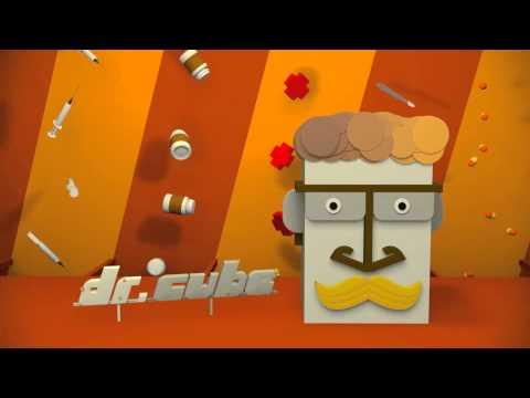
Recently I have begin to watch a lot of video on YouTube center around the game call of duty. These video seem be done just for fun or contests and deal with synching up music with video game play. I never really plaid the game but many of the videos are nicely edited and time with music and some even have vfx’s added as well.

I was contacted by one of these people to do an opening animation for their channel After receiving the initial brief and doing some research on the channel finding out that it’s main focus is video games and call of duty I designed some initial Style/Storyboards.


The client picked the the third version which was the on I like the best. They had a few remarks on the design so I revised the design and create three options and they picked the second version .

Then I proceed to turn the design into an animation. I wanted to try something different on this project and instead of using my standard 3d package cinema 4D I tried a go at using Photoshop 3d animation.


This not something I would do again since it move very slowing in aftereffects and in order to get to the full quality I had to do a bunch of work around other wise it would have been unrenderable on my machine. Having just the simple extruded text with full ray tracing took a bit to render in photoshop and once in After Effect was too slow to do anything. Even so I still had to render some parts out first then render the rest as a whole. The final animation was renderd at 1080p HD.


Categories
Daily 365 Motion Graphics

Wijmo Logo Animation


A while I was looking thought some free logo download website and I came across a bunch that I liked and save the link. After hitting a snag(which I know have an idea to get pass) in one of my other project I decided to take a quick break and work on something different. I searched through my logo links and found a cool logo on http://www.gmkfreelogos.com. I thought the design looked cool so I downloaded the file and it happen to come with a bunch of different variations and styles.

I was about to begin to design the final scene when I thought to look up the actual company.  Seems the company that produces these UI widgets is just as cool as their logo. Looking around there site I was able to produce the final end frame base on the bar chart which is one of their widgets. I have found that after doing these random logo animation the ones that turn out the best or that get finally made are the ones where I have ample information about the company. Just goes to show you the power of researching and information.

I brought everything into after effects and began to rig the main robot creating effect controllers that would let me animate the robot with ease. Arms rotation, retractable arms, writs rotation (which I didn’t use), hand open close (which I also didn’t use), eye close and movement, lower body thruster angle.  The fire also has some slight movement to it as well.

I outline the animation with little thumbnail of how the animation would play out I originally had it timed  out for 5 seconds but It felt rush so I just extended it which also allowed me to find a sound track that timed up well with it that I got from http://freeplaymusic.com/.  The sfx I download from http://www.freesound.org and my own personal collection.

On the whole I think the animation turned out all right. I took longer to complete then I wanted it too but I was able to answerer a question on Creative cow that happen to deal with my project as well. http://forums.creativecow.net/thread/2/1002593 Though I didn’t use my own expression in my own project since my parent hierarchy was crazy. The one thing I wish I could of found a decent solution that wouldn’t take a lot of time was getting the bolt on the head to move around and look good. I tried a few ways with beam and lightning but it didn’t look good.

This logo animation was not commissioned by Wijmo just done for fun. Check out http://wijmo.com if you’re into web design and development.

Categories
Daily 365 Motion Graphics

Designers Couch Logo Animation

I have been on Designers Couch for a while now and after looking at the logo over and over I thought why not create an animation using their logo. Thus the idea for an animation was born.  (If you don’t know what designers couch is it is online art community similar to Deviant Art but invite only with high quality work.)

My idea for this animation was to have the logo appear, then the couch form, and then text roll out. Along the way I got the idea for the particles to form the logo with a little delay bounce. I also added bounce on the couch logo part but I should have pushed it more to make it more noticeable. The text is a simple animate in with some bounce back.

The tag line I wanted to do more than slide in since I did that already so I came up with the idea to use the underscore that is part of the text to reveal the tag line then animate back under the text to form the final logo with text. The background was the last thing I added. I felt that the flat red to black gradient was too plain so I added the flat DC logo I recreated and looped it behind.

So here is my end tag of sorts using the Designers Couch Logo.  Overall it’s ok but could be better. I also think now I should do one for DA as well considering how long I have been on that site.


The awesome Ident music is by Alkis from audio jungle.


Categories
Daily 365

Designers MX Animation

If you haven’t checked out Designers.MX you should check it out. I made a previous post with some work in progress about the site so check it out for more info.

My goal with this animation was to create something that showed of the mix tape covers and in some way have them all fly int to main logo/title. In that sense I made what I wanted, however the look the I have ended with is not what I envisioned. I see many many things that I would change/fix but I needed to get this animation out of my computer so I can work on some other  stuff.

I made this in Cinema 4D using mograph for animating the mix tape covers. The mograph shader came in real handy for applying the mix covers.  The compositing I did in after effects. I wanted to try and emphasize the sound track and the music since the site is all about music so  I added the sound waves to the corners that actually go with the sound in either the left or right channel. The also get brighter/zoomy along with the whole scene when the beat kicks in.


feed back welcomed


Categories
Downloadable

Source Files for DuckDuckGo Logo Animation

I was asked by Gabriel the founder of duckduckgo if I could open source the raw files so below you can download the original project that I worked with. I left all the key frames and what not in it. There are two projects files, both are the same the only diffidence is I universalized one so that it can be used one systems that don’t have English as the default language . This way the expressions don’t break.

DuckDuckGo Logo Animation

Categories
Daily 365 Inspiration Mograph Notes Motion Graphics

DuckDuckGo + Process from the Pro’s

DuckDuckGo is a new search engine that I have been using for about a week or so now. It pretty useful for get information without having to do a lot of searching courtesy of their “zero click info” box. I have yet to use 100% yet, something’s I still use google for like maps and images but there are plans to implement some of these things.

The idea for this quick logo animation just came to me for looking at their search page at their logo and thinking it would be cool to see it quack. So I decided to make a quick animation that would involve the duck quacking. I did a quick outline that involved the duck duck goose game to tell about the search engine since that where the name came from. Originally I made the re-made the logo then found their forums where they had the Illustrator version…mine was almost exactly the same.

My animation turned out ok I think, I notice now that the Go bounce looks a little off but that may just be because I’m going frame by frame. I used my copy of the The Animators Survival Kit to try to get the bouncing right. I haven’t done a bouncing ball since my third year of college.   I also noticed that the head looks a little too stiff when the duck is quacking I think adding some more movement to the top beak might have made it look even better.


The second item I would like to share is the process page of capacity If you have watched NBC or Cartoon Network there is a good chance you have seen some of their work. They have been featured on motionographer a few times but for some reason I don’t recall checking out their site. Not sure how I came across their site this time but I started looking through their site and found their gold mine of a process page which has break downs on some of their projects.

Finding out the ideas behind a project is really cool and it’s even cooler that they share their process. It is always very enlightening when you can find out the why behind the what of a project. I listed bunch in my delicious account that I just started using recently. I also listed three of breakdowns in my new fav category I created just for them.  This reminds me of perceptionnyc breakdowns that will promptly be added to my delicious soon.

Categories
Motion Graphics

Dreary Walk Final

YouTube Preview Image

This is the final version of my Dreary Walk animation. I made most of the tweaks I noted before in my last post.

Categories
Daily 365

Dreary Walk


YouTube Preview Image

This is an match-moving animation I worked on for the PFhoe AE-Tuts Contest. My original idea was to do a family circus path line after a few lines of text. You can see a test of this on my 365 page. I was going to do this in Cinema 4D but the path looked like it was sliding awkwardly. I tried it in after effects and it looked off as well.  So I scraped that idea and went with an all text approach.

I found a good quote that went from negative to positive and animated the last word in each part. This allowed me to keep my overall idea  of going from dark and dreary to positive and happiness.  I used some color correction techniques from the Color Correction Handbook I won from AENY to try to simulate going from a dark grey scale dreary world to a lit up bright happy world. I think I should have pushed the end color more but it didn’t quite feel right the way I was going. I also added a moon in, which is hidden/blurred most of the time, some depth of field and a glow sun at the end.

I’m not sure if this will get in or not since I did submit after the deadline of midnight. For some reason I though it would be tomorrow’s midnight, which of course would be 7th not 6th. So shame on me for not understanding the due date.

Lastly for the list of all the thing I need to fix. I won’t be submitting these but it will be good just to make it more final.

  • overall text feels…odd…not sure what it is though
  • Some of the text’s fade out seem a little quick I need to adjust for that
  • I seem to have lost the depth on the Annoy letters, need to fix and re-render
  • When the JOY text comes in there a blur on the whole thing, not just the joy
  • The Joy doesn’t seem real joyous, need to add some more pop to it
  • The Joy floats back and thought I knew how I did it but apparently not and I feel like it is out place even though I liked it at first
  • end was click in the audio
  • shadows… there are none in the scene but putting stuff in the scene need shadows to make it feel there. Not sure what to do about that.


Audio from http://www.incompetech.com


Categories
3D Animation Motion Graphics

Nickelodeon Hand Clapper Animation

YouTube Preview Image